I recently joined the Dataseer Grab Challenge 2017, a data visualization contest to showcase local data science and design talent. The contest concluded last March 1, but I've only recently found time to sit down and write about my entry. I really enjoyed participating in this contest and wanted to share the thought process that went into it.
Contest Background
We were given around 250,000 rows of 2013 GrabTaxi data (no GrabCar). The dataset contained the following fields:
- Source (e.g. iOS, Android, Grab booth)
- Timestamp
- Pick-up and drop-off location (latitude and longitude)
- City (Metro Manila, Cebu, or Davao)
- Fare
- Pick-up Distance (how far the driver was upon accepting the booking)
- State (Unallocated, i.e. no driver accepted, Completed, or Cancelled)
The instructions were open-ended: "Create a visualization of the provided dataset using a software package of your choice."
My Approach
I was initially tempted to make some kind of dashboard that shows you multiple aspects of the data at once, with interactive controls like filters and parameters to dynamically explore the data. While this is something most clients at work would ask for, I wanted to take it up a notch and used the "consulting approach" to tell a story with the data.
In the contest instructions, special emphasis was given to two metrics: Allocation Rate (AR) and Actual Allocation Rate (AAR). AR referred to the percentage of transactions that were matched with a driver, while AAR referred to the percentage of transactions that were actually completed. In other "words,"
- AR = [# Allocated] / ([# Allocated] + [# Unallocated])
- AAR = [# Completed] / ([# Allocated] + [# Unallocated])
I wanted to center my story around these metrics because they are simple to understand and are effective enough in gauging Grab's success. While digging through the data, I kept these questions in mind: Were they able to service the transactions and requests made? If not, why? How could they improve?
To start, I tried dissecting the data to find out which factor had a significant difference (visually, not necessarily statistically) in AR among its values. I then came up with this:
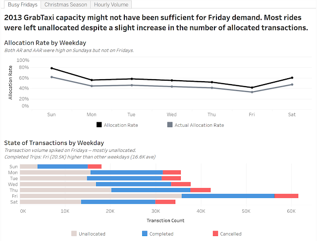
AR and AAR dipped on Fridays, but upon further inspection, this was primarily because of the sheer number of requests made. In fact, Grab was able to complete more trips on Fridays than any other weekday, but the number of unallocated transactions was just too much to handle.
How difficult is it to satisfy the unallocated demand? Allocation rate averaged just 52.6% on weekdays. Almost every other request for a taxi was not satisfied. Were taxis just at the wrong place at the wrong time?
Alright, where did all those taxis come from? How was Grab suddenly able to allocate 3,000 rides a day in December, but only 65% of the 1,200 requests on other months were allocated? Since Grab doesn't really have its own fleet (as far as I know), were more applications just approved in bulk to cater to the holiday season? If so, management can consider keeping some of that additional capacity in succeeding years to increase allocation rate in the other months.
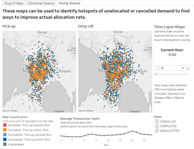
Due to the lack of fleet or capacity data, I decided to map out the pick-up and drop-off points from the dataset to see if there were any obvious patterns. As expected, there was a morning and evening peak, with the evening rush hour being the busier of the two. Most of the pick-up points were centered around the business districts, with drop-off points scattered all over the metro.
(Note: The image below is just a screenshot. Scroll to the bottom of this post for the interactive visualization.)
This was my favorite slide in the entry. I even made a video capturing the time lapse effect because the automated play function doesn't work when the visualization is uploaded to the web (Tableau Public limitation). Sorry for the awkward phone video — I had nothing else to capture it.
The colored dots may look a bit messy here, but in the interactive version, you can select a color from the legend to wash out the other colors and focus on that type of transaction. I also took some time to finalize the colors used. I initially had red, orange, yellow, and green because, admit it, a stoplight motif is commonplace in Excel files and other reports. However, it actually doesn't actually look all that great and discriminates against red-green color blindness. Good data visualizations should be color-blind friendly! Anyway, I eventually settled on these colors after testing multiple combinations, and I'd like to think that the palette blends well.
There was a snippet in the instructions about how Grab thinks that 3 km is the optimal pick-up distance — any further and the probability of cancelling exceeds a certain threshold. While I did not seek to verify that statement, the map does attempt to spot areas that were often allocated to drivers more than 3 km away. Management can then consider measures to ensure that more drivers pass by those areas.
Closing Thoughts
To be honest, I wish I spent more time on this contest. I crammed most of the work on a Sunday night and was not able to explore some dimensions of the problem nor create a rock-solid recommendation. However, I did have a lot of fun, and I am pleasantly surprised with my output. Compared to the other things I've done in this blog, this definitely looks a lot better and (I hope) is more impactful. In the end, although I didn't place in the top three, I made it to the "honorable mentions" and had my work featured on the contest page. Yay!
Here is my interactive visualization hosted on Tableau Public. If you're curious about Tableau, or if you want to do something like this but you're stuck with Excel, message me. Kape tayo. :D
After seeing the winners and other honorable mention entries, I am actually very optimistic about the future of the data visualization scene in the Philippines. Many also used "consulting style slides" like I did, and the winners definitely tackled the problem with more depth and quality visuals. Very humbling. If you're interested to see the other winning entries, check them out here:
Shoutout to Dataseer, Grab, and the AIM Analytics Club for hosting this contest. I hope to join more of these events in the future!


No comments:
Post a Comment